Project Three: Typography | Type Specimen Poster
Exercise One

I believe the least effective font is Zapfino since it cannot connect to a specific form of tradition. Trajan color can be used to represent tradition of prosperity and wealth and invokes feelings of ancient Egypt and similar societies. Luminari involves feelings of traditional Asian societies through the varying weights of strokes reminiscent of calligraphy. Times is able to represent tradition in a more modern sense since the font is known as the default serif for most people, yet still commonly used. Lastly, I believe the most effective font is Snell Roundhand since it is reminiscent of older luxury brands and the clean cursive of our grandparent's generation.
Exercise Two


Throughout, I tried to highlight the important aspects and differentiate between days. In linespacing 1-A, I tried to separate between the basic information and each day. In Linespacing 1-B, I choose to highlight more aspects, including separating specific and general locations, “Admission free” and the title of the series. In 2. Typographic Weights A, I also chose to focus on these features and used bold text. In B, I placed less of an emphasis on the specific location. In 4. Typographic Weights and Linespacing, I combined the features of the first and second parts. Lastly, in Typographic Weights and Horizontal Shifts, I tried to differentiate each day, part A grouped each day together, whereas part B sectioned out and highlighted each day of the series.
Baskerville Research / References
My initial research of Baskerville font provided a foundation, illustrating the typeface as a classical serif. The typeface is characterized as a transitional serif, known for its legibility and high contrast.
Created by John Baskerville in 1757, Baskerville font has the product of John Baskervilles extensive study of font following his years in the printing business. Baskerville also studied other aspects of the print business, including ink and paper formulation, the design of the printing press and cover design, all of which are thought to have influenced his design of Baskerville font.
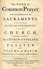
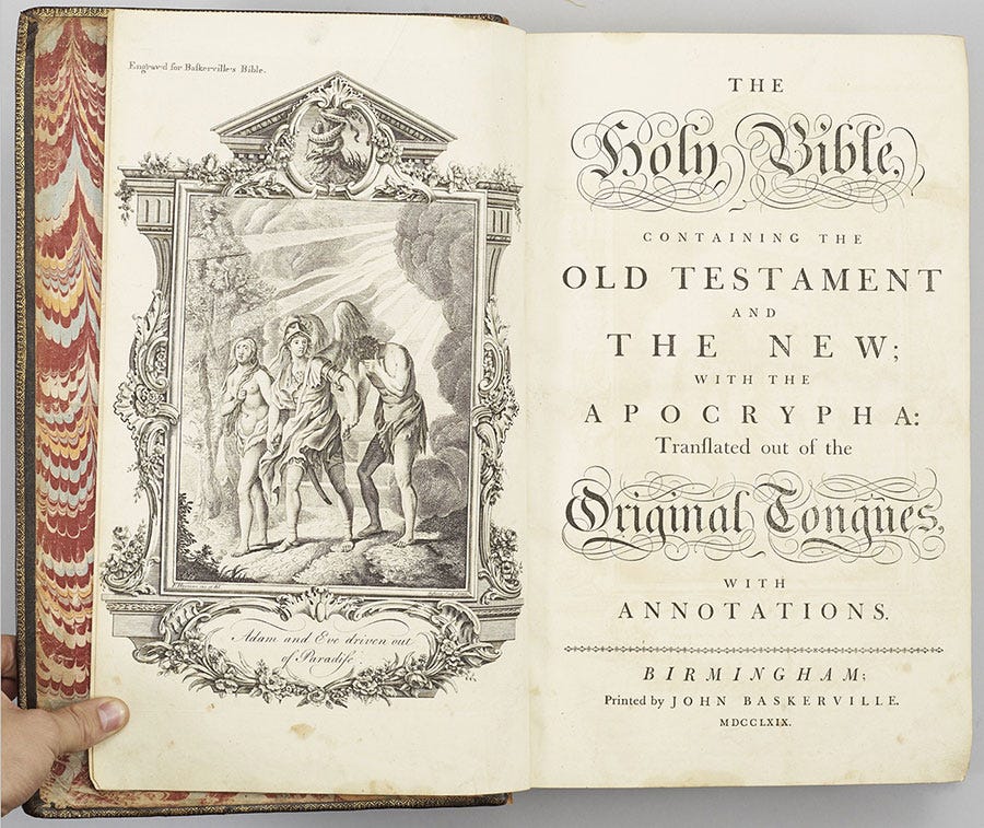
Baskerville font was first showcased in John Baskerville’s poetry — Virgil. The publication was applauded for its design and, as a result of the font’s reception, Baskerville spent years producing a bible that featured his font for the University of Cambridge.
Baskerville is known to have corresponded with other notable creators in the printing business, including Benjamin Franklin. Baskerville typeface is thought to have been in consideration for printing the Declaration of Independence; however, it was beaten out by Caslon font since ut was already widely used in the Americas.
Poster Sketches
Following my research of Baskerville, the font left an overall impression of classicality and musicality, which I tried to bring to my designs.
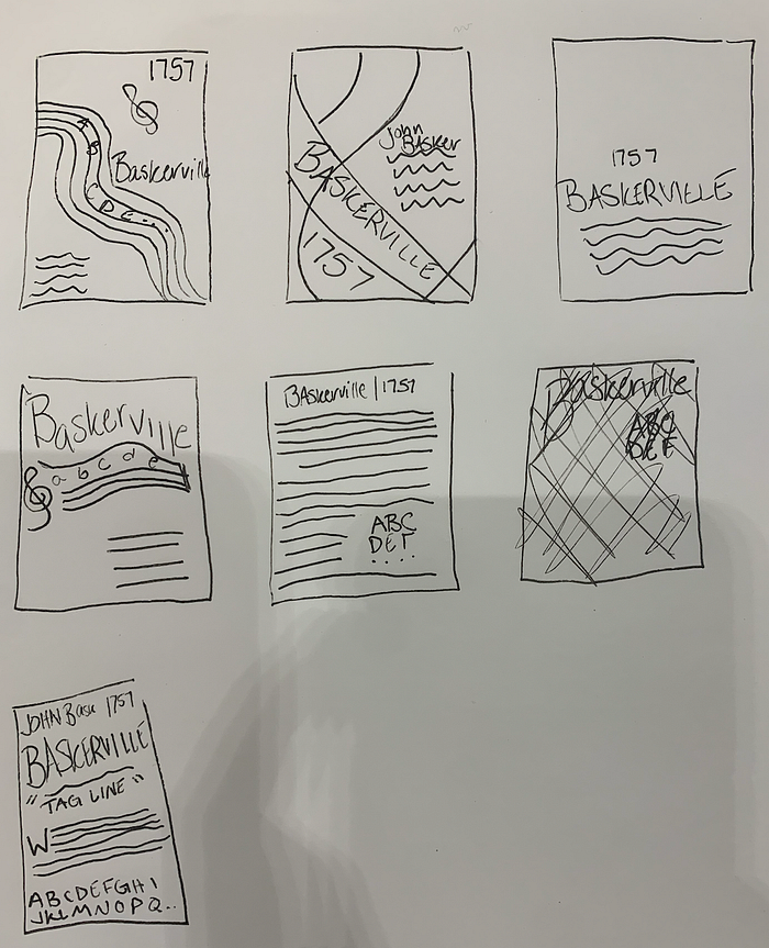
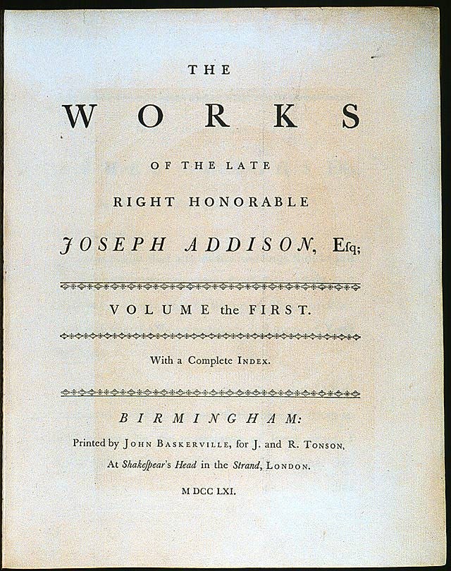
The first and fourth designs try to incorporate sheet music and the treble clef; however, as the treble clef is not included in the font’s character set, I was unable to incorporate it in my final design. The second design incorporated the ampersand, as it embodies the flowy aspects of music without referencing it too directly. Additionally, the ampersand serves to illustrate the transitional aspect of the font, showing the combination of traditional & modern. The third illustration replicated the first page of a chapter book, as the font is widely used in this aspect. The fifth design was inspired by the bible, as Baskerville’s bible is often credited with being the introduction of his font to the world. Lastly, the sixth design was inspired by early printings of the Declaration of Independence.
Reference Images



Poster Drafts


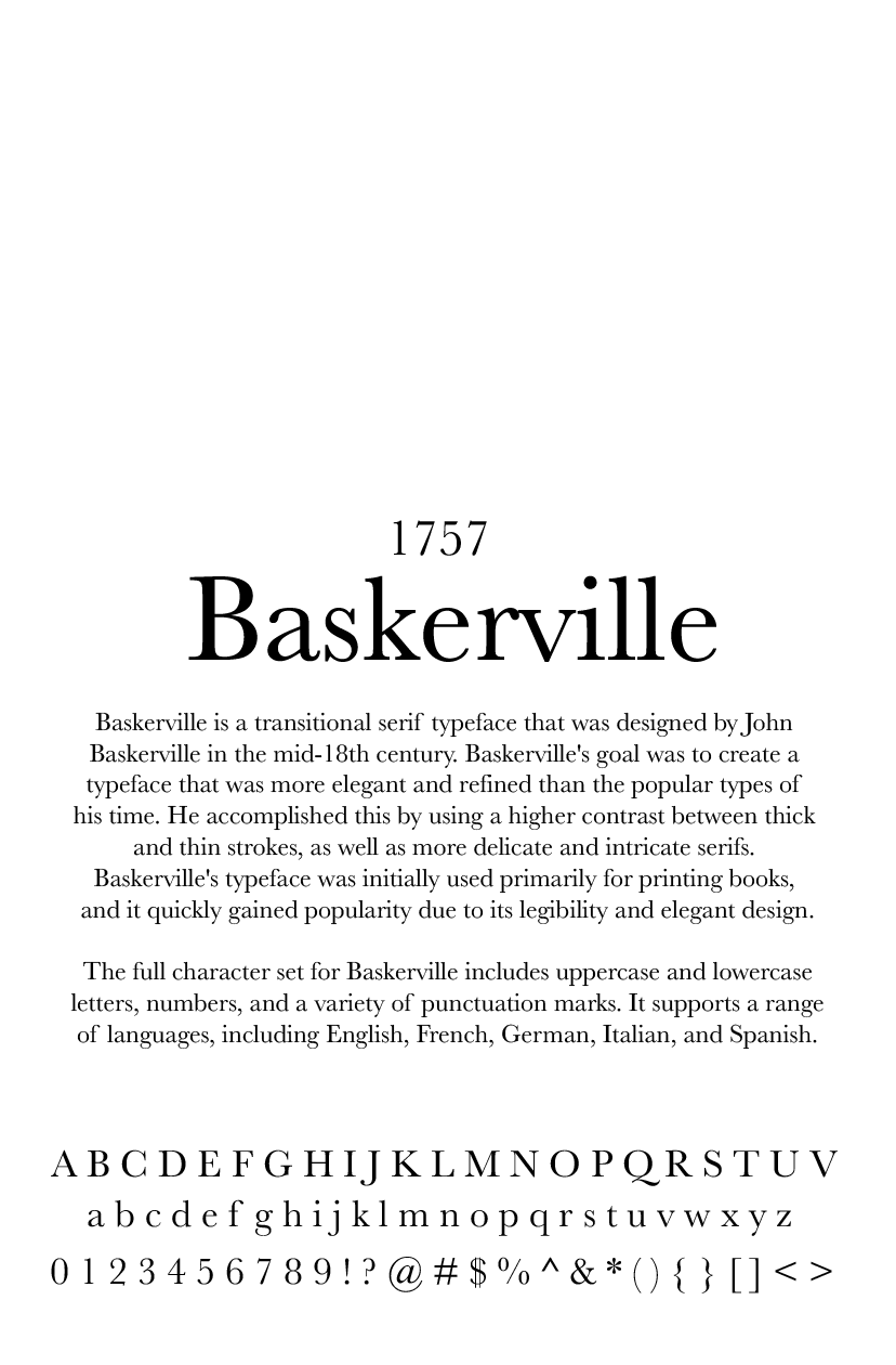


After creating my initial drafts and receiving feedback, I decided to focus on using the bracket symbol rather than the ampersand. Additionally, I tried to focus on creating a figure-ground design as a representation of the duality of Baskerville.
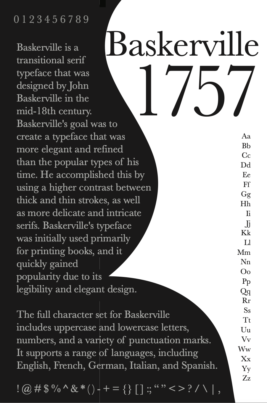
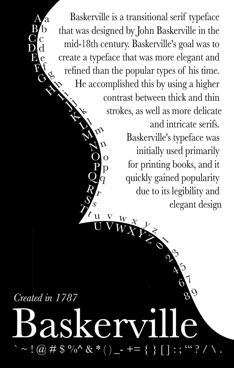
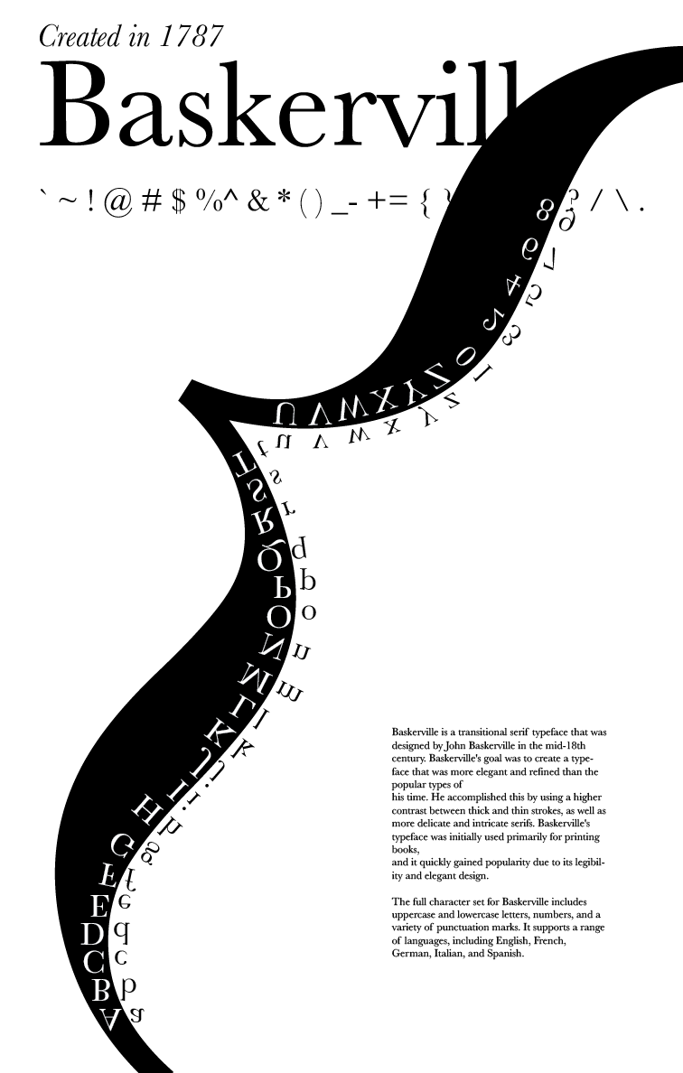
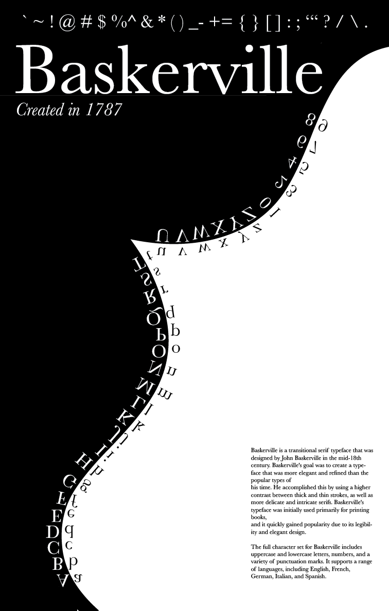
In the different variations of my figure-ground style design, I made adjustments to fix the hierarchy of content, decrease the body paragraph font size to be more legible, increase the contrast of colors and fit the full character set along the bracket.
